Creating a multi-product design system
Introduction
Terragon Group is a martech company with multiple products. The goal of this project was to build a design system to define a common design language foundation within Terragon Group for its products. Given my advanced skillset within the design team, I was tasked with examining all the existing products to find similar patterns with the end goal being a design system.
Terragon Design System
Client
Terragon Group
Industry
Marketing Tech
Platforms
Web
Expertise
UX Design, UI Design, Design System Management & Documentation
My role
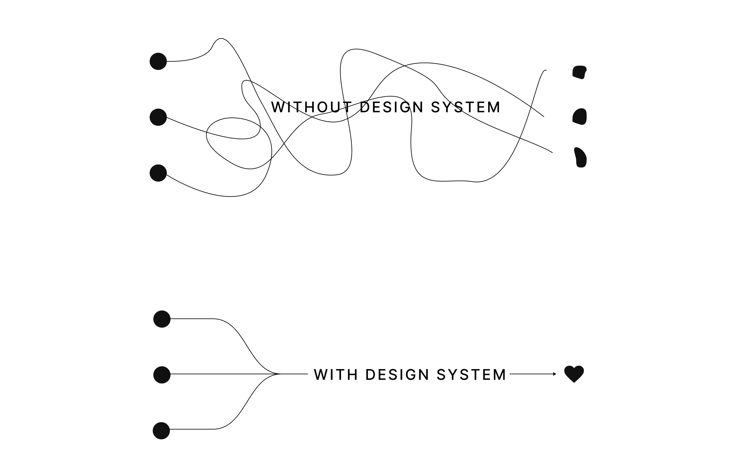
Until 2021, Terragon had no design system in place. Products existed on the web as separate identities with individual teams creating their own source of standards for UI elements and components. As the team became bigger, we realised that it was unsustainable. Here are some of the problems we found:
- Inconsistency and incoherence across products and features.
- Conflicting design guidelines and direction.
- Duplication of efforts across teams leading to reduced speed, efficiency and quality.
- Disjointed communication across teams.
Selling a design system
One issue we encountered early on in the project was decision makers convincing within the organisation about the need for a design system. We had a presentation for key members of the organisation on the problems we were facing at the time and how a design system would solve those problems.
Getting started
The main goal going into the project was the unification of user experience and interface design across all Terragon products, which will help us to easily maintain the design system on both design side and development sides.
My research into the approach of industry leaders like Atlassian and Airbnb helped to clarify our own approach. I then went through all Terragon products with a fine tooth-comb, mapped out components and patterns from the simplest to most complex, and also defined design and development guidelines.
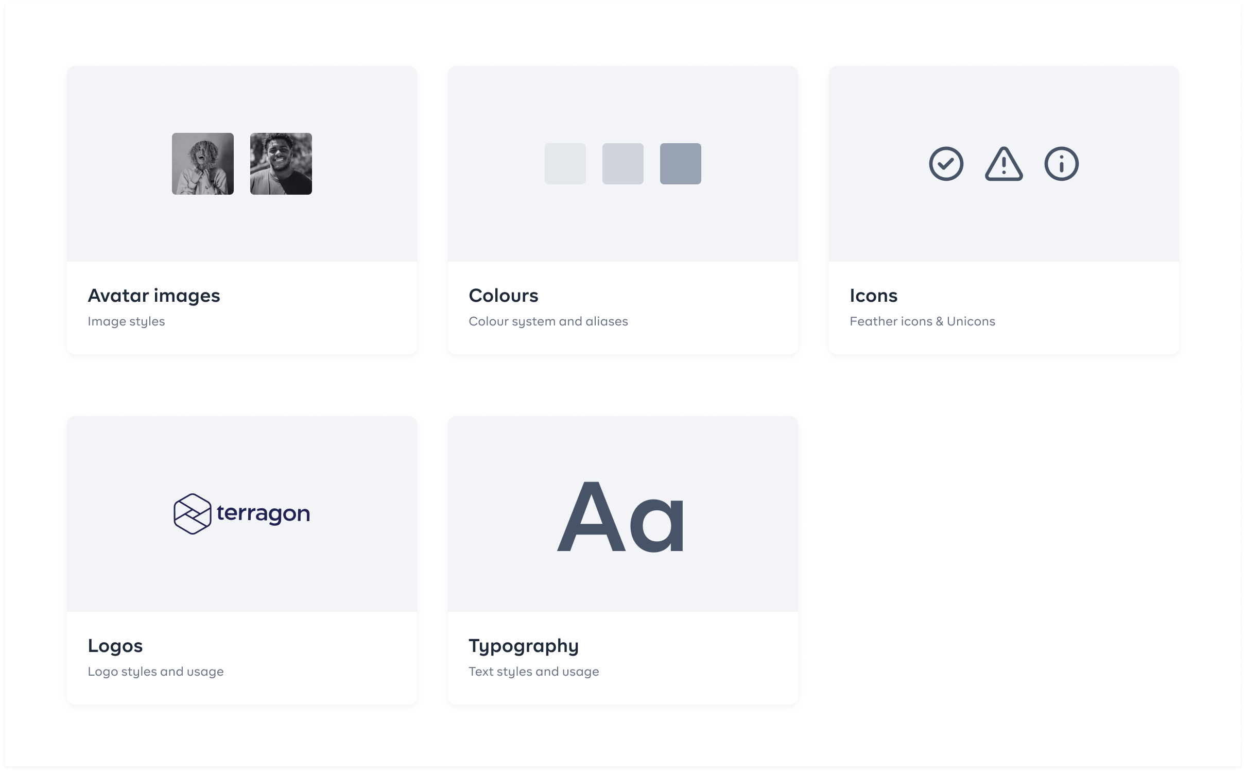
Foundations
One of the most important activities in creating the design system was to ensure that all our teams were aligned on the foundational elements for each product. Since the design system will be used across all web products and websites, it was necessary for our foundational elements to account for every potential UI element. Our foundations included colours, typography, logos, icons, images, grid systems and spacing.
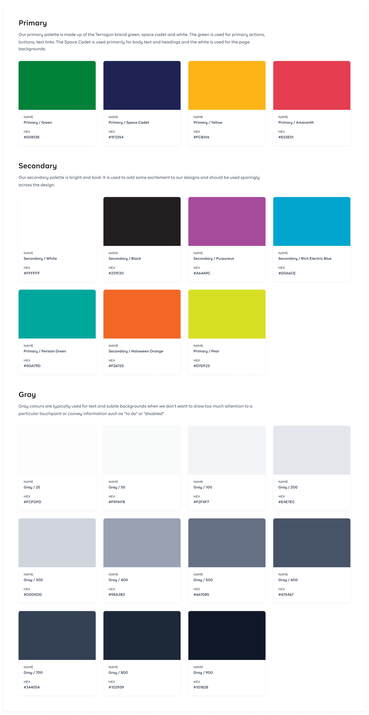
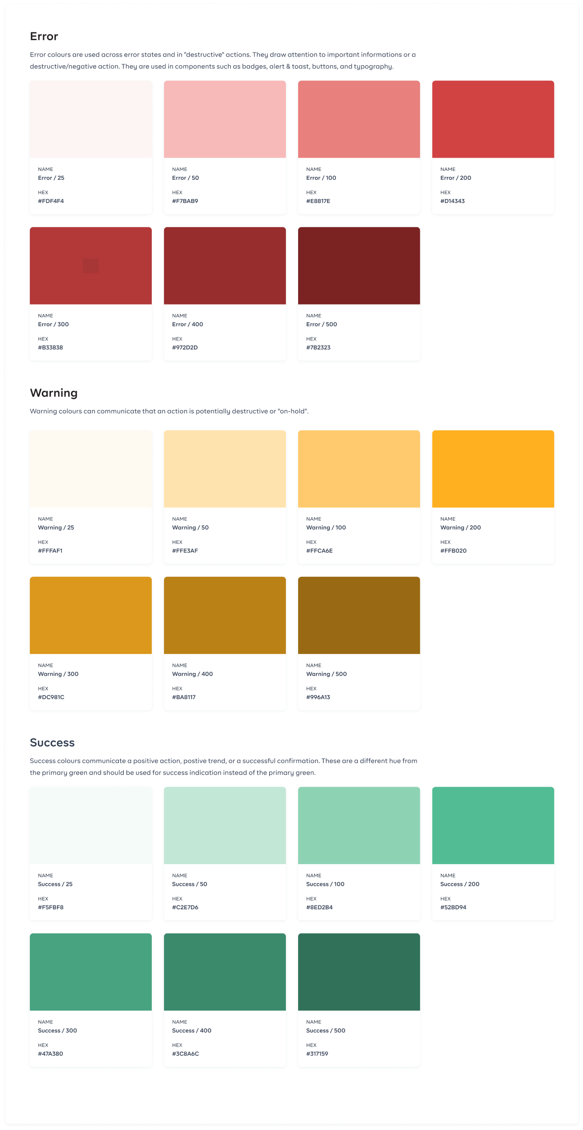
Colours
Our colour palette was broken down to different categories based on their functions. Each colour supports the purpose of the content, communicating things like hierarchy of information, interactive states, and the difference between distinct elements.
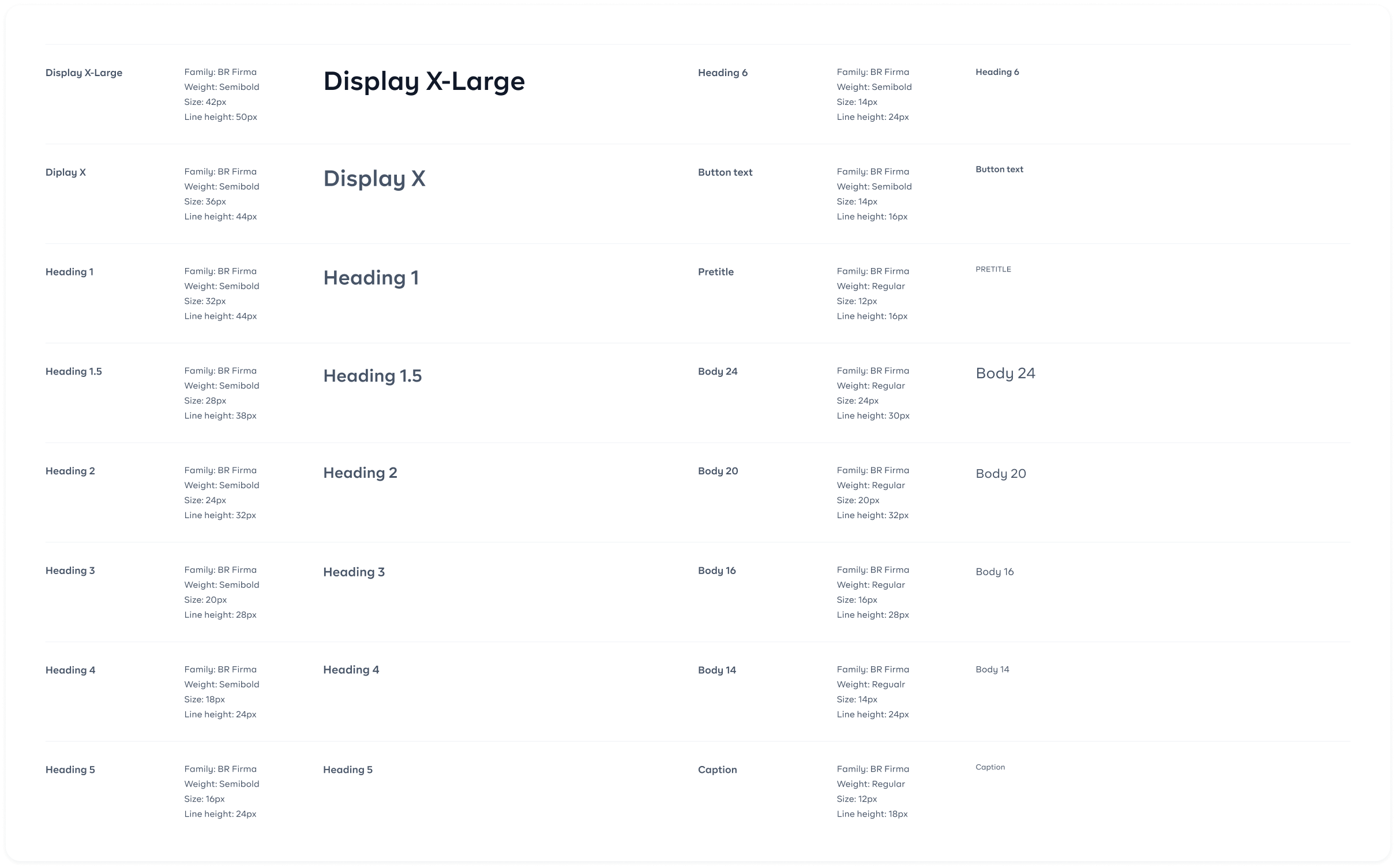
Typography
We wanted to use a clean and versatile font for this system. We chose BR Firma because of the shape of the letters and the spacing between the characters. It also had a wide variation in weight which makes it look good for headings as well as body texts. It also solved the problem where the Regular weight of some of the fonts we previously used was too thin and the Medium weight too thick.
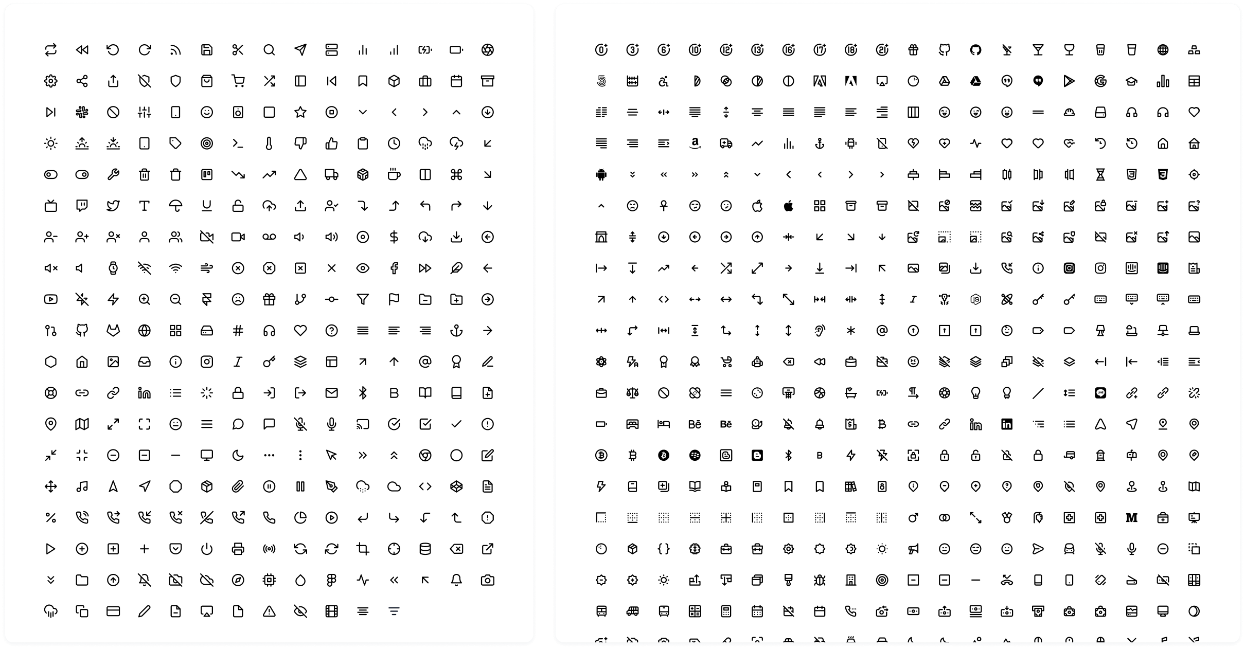
Icons
I opted primarily for Feather icons (and Unicons as secondary library in cases where a suitable icon was not found in the Feather icon library) for the reason that they’re simple, informative, and complement the overall visual language of the design system. Both icon libraries are also visually similar which allows them to be combined.
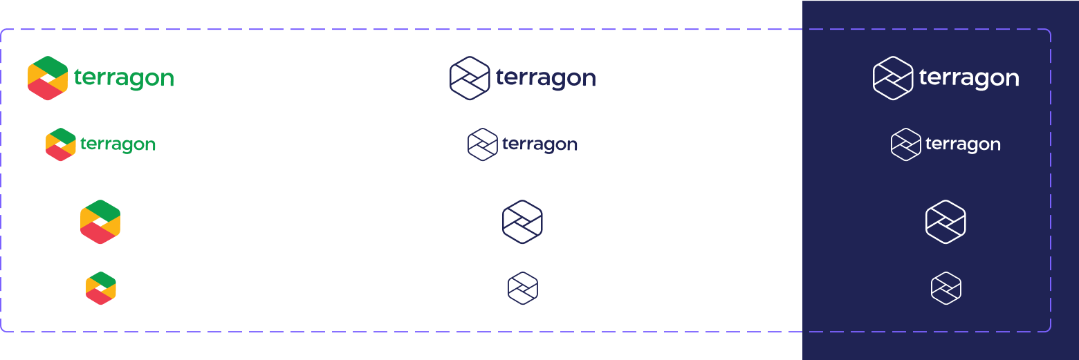
Logos
Terragon brand logos and product logos are clear and recognizable. It is available in three color schemes: coloured, neutral, and white. The coloured version works best on a white or light background. The white version should be used on dark backgrounds. The neutral version can be used when the hierarchy calls for the logo to recede, but should always be evaluated for adequate contrast.
Avatars
It was important to have avatars reflect Terragon Group’s market: Africa. I put together a library for open source avatars to help our designers create for the market.
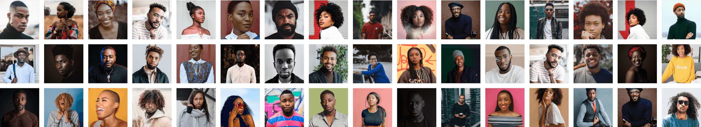
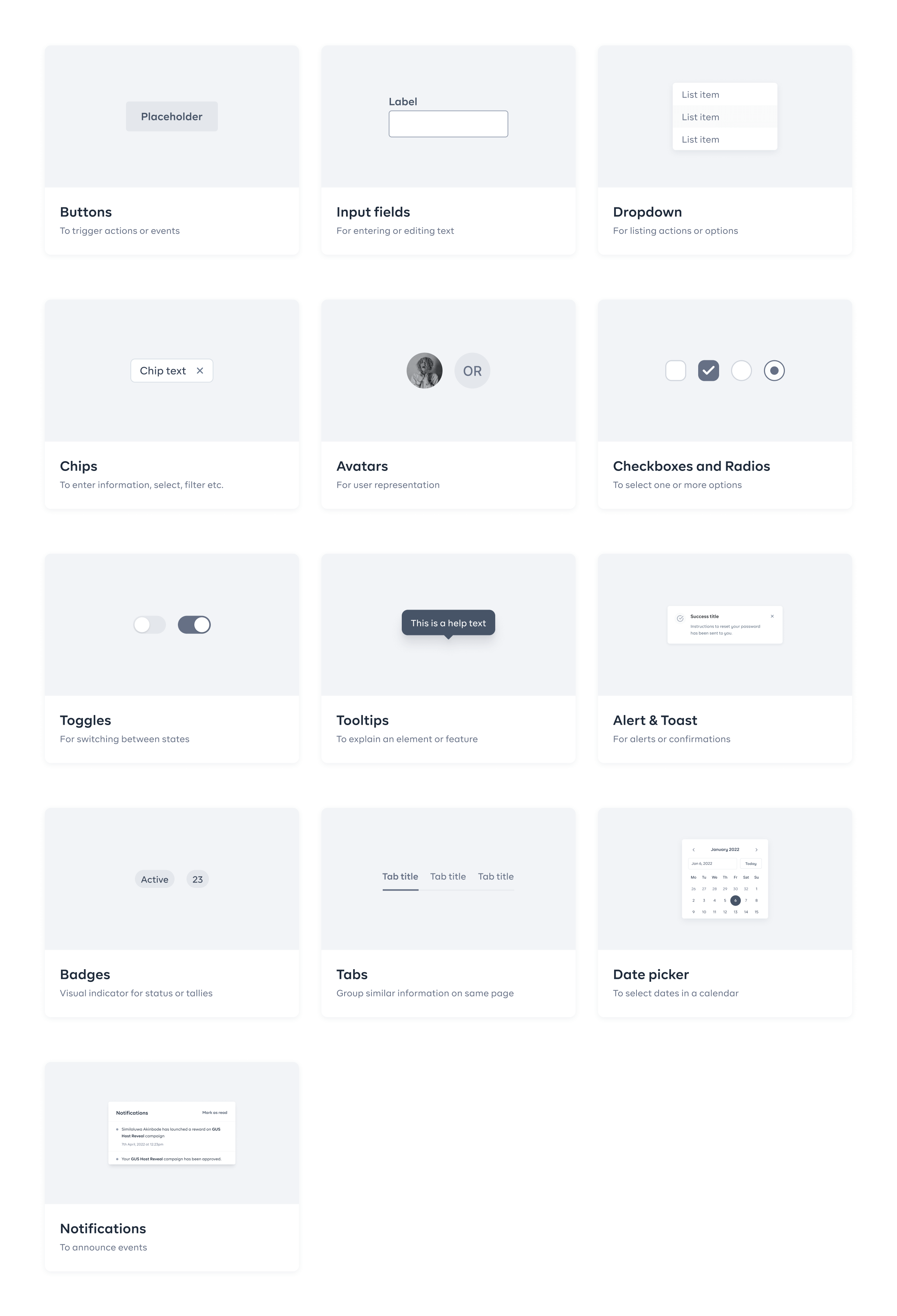
Components
Having defined the foundation, I started to create the reusable blocks of the design system such as buttons, input fields, drop-downs etc. The components had to include many variables in order to cover many use cases. All the Figma components were created using auto-layout.
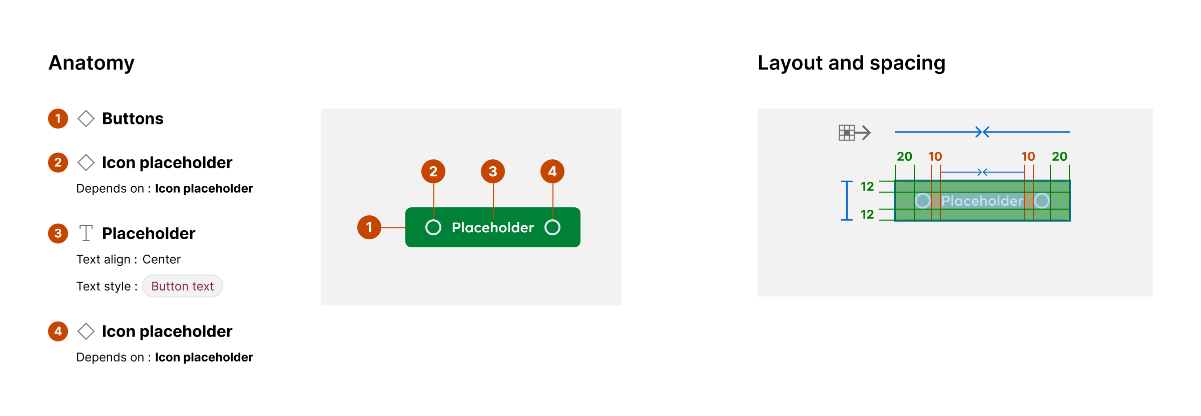
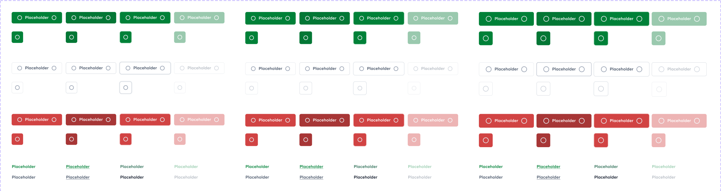
Buttons
Taking a button as an example, we used defined typography styles for the text, the colour system to define the colours for every state and spacing presets to make sure everything could scale to different texts.
I used Figma component properties to create as many variables as I can while also keeping it light so as not to overwhelm the designers.
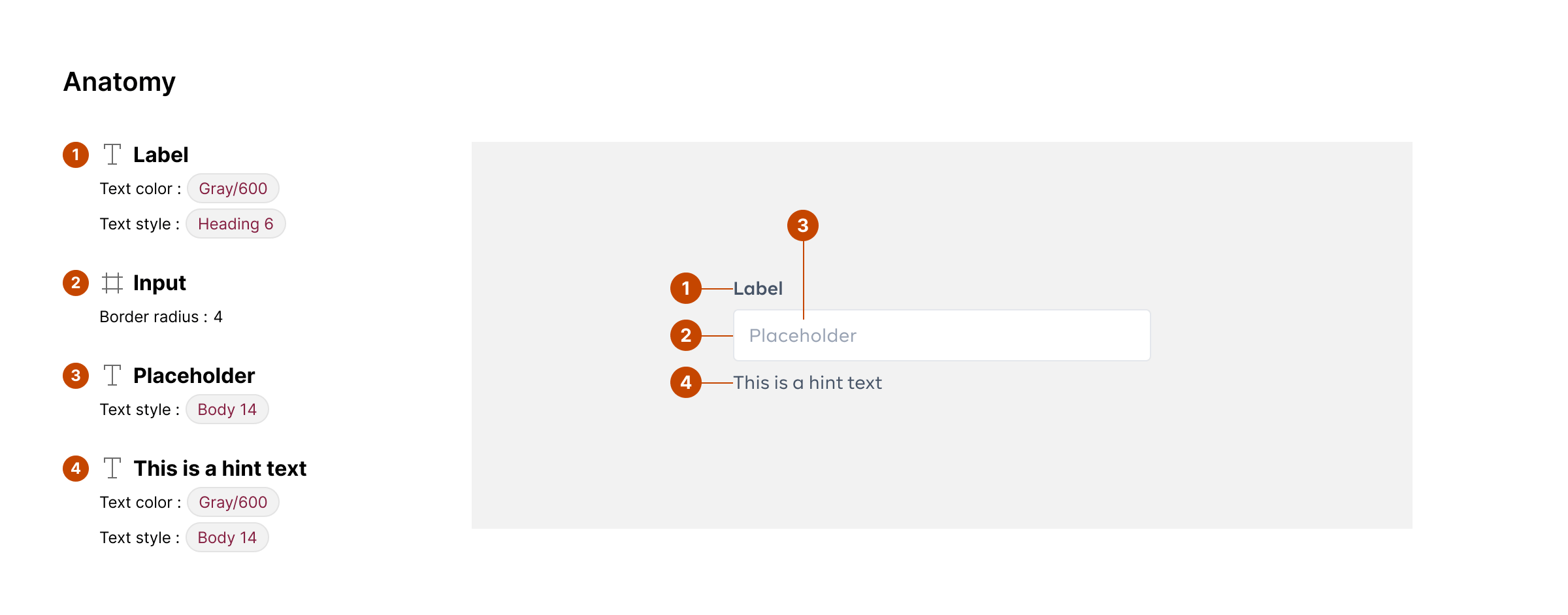
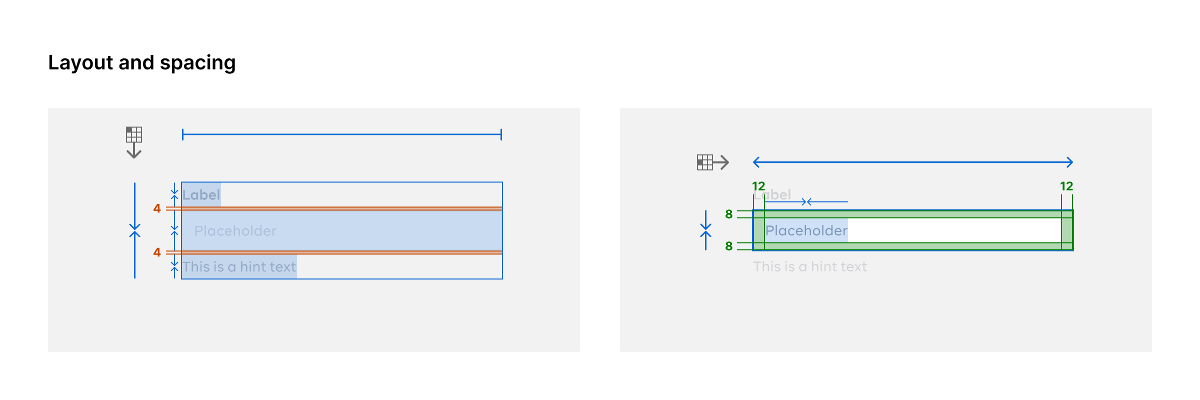
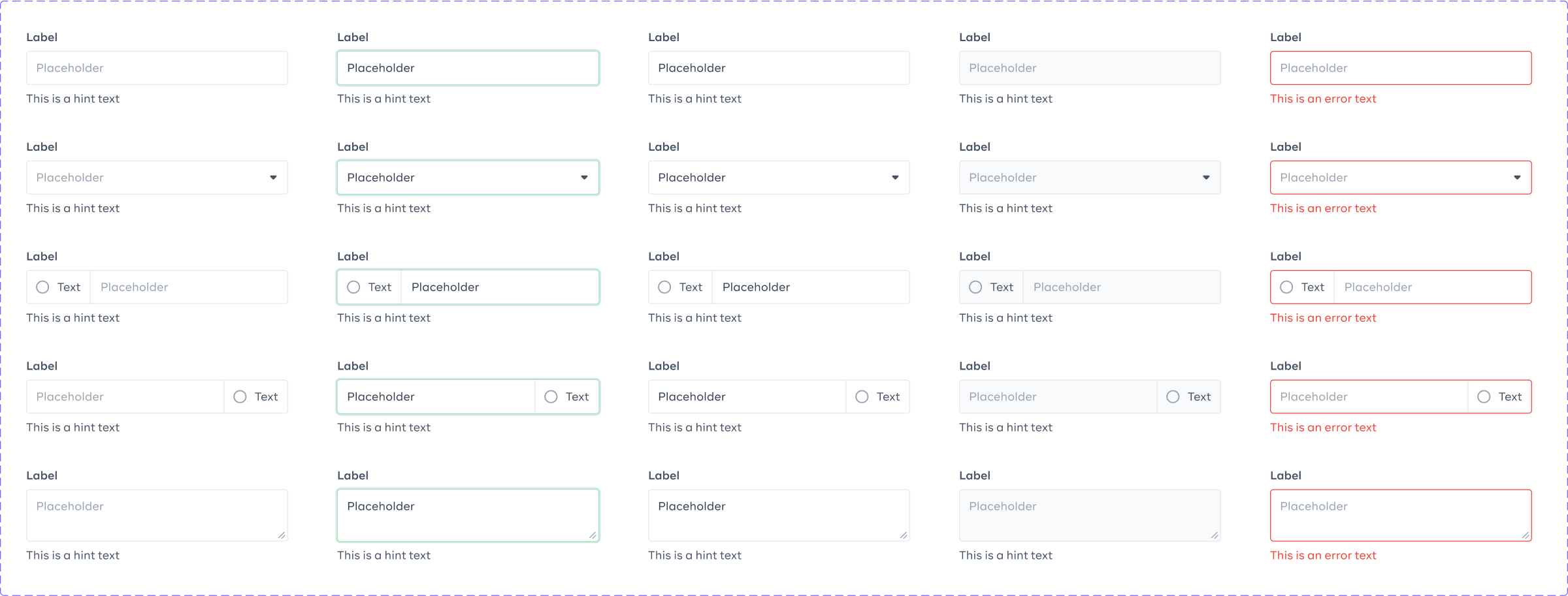
Input fields
Another big category of components for the design system is input fields. They need to accommodate several different states and to be accessible. I defined the anatomy and the layout of the different states while making sure that the components cover all the possible variations we encounter in our forms. The use of component properties and auto-layout also made it easy for the designers when using them.
Other components
Other components I worked on are dropdowns, radios, checkboxes, toggles, chips, avatars, toasts, badges, tabs, modals, tables, file uploads and date pickers. I worked with the rest of the design team to figure out the components needed in their workflow and then prioritised them in order of need and then created those components.
Design systems are living organisms in the sense that they are always evolving. I constantly worked with the rest of the design team to know their needs and then used the information to prioritise what component gets added to the design system at specific times.
Shipping and maintenance
Lastly, I worked with the engineers to prepare a plan to ship the system into production. Because there were a lot of products to be shipped and we had limited engineering resources, the plan was to ship styles and minimal elements such colours, typography and buttons first.
Until the end of 2022 when I left the team, I combined working on other projects with maintaining the system, updating and creating new components to attend to the design team’s needs. The system continues to be active and being used daily by the design team, receiving lots of positive feedbacks.